Case Study
Case Study
Case Study
Case Study
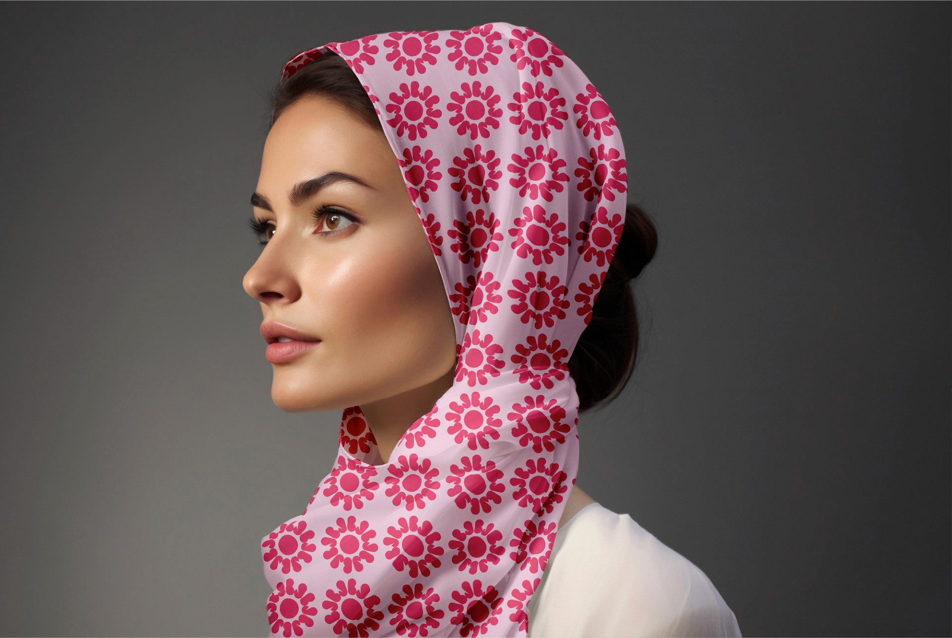
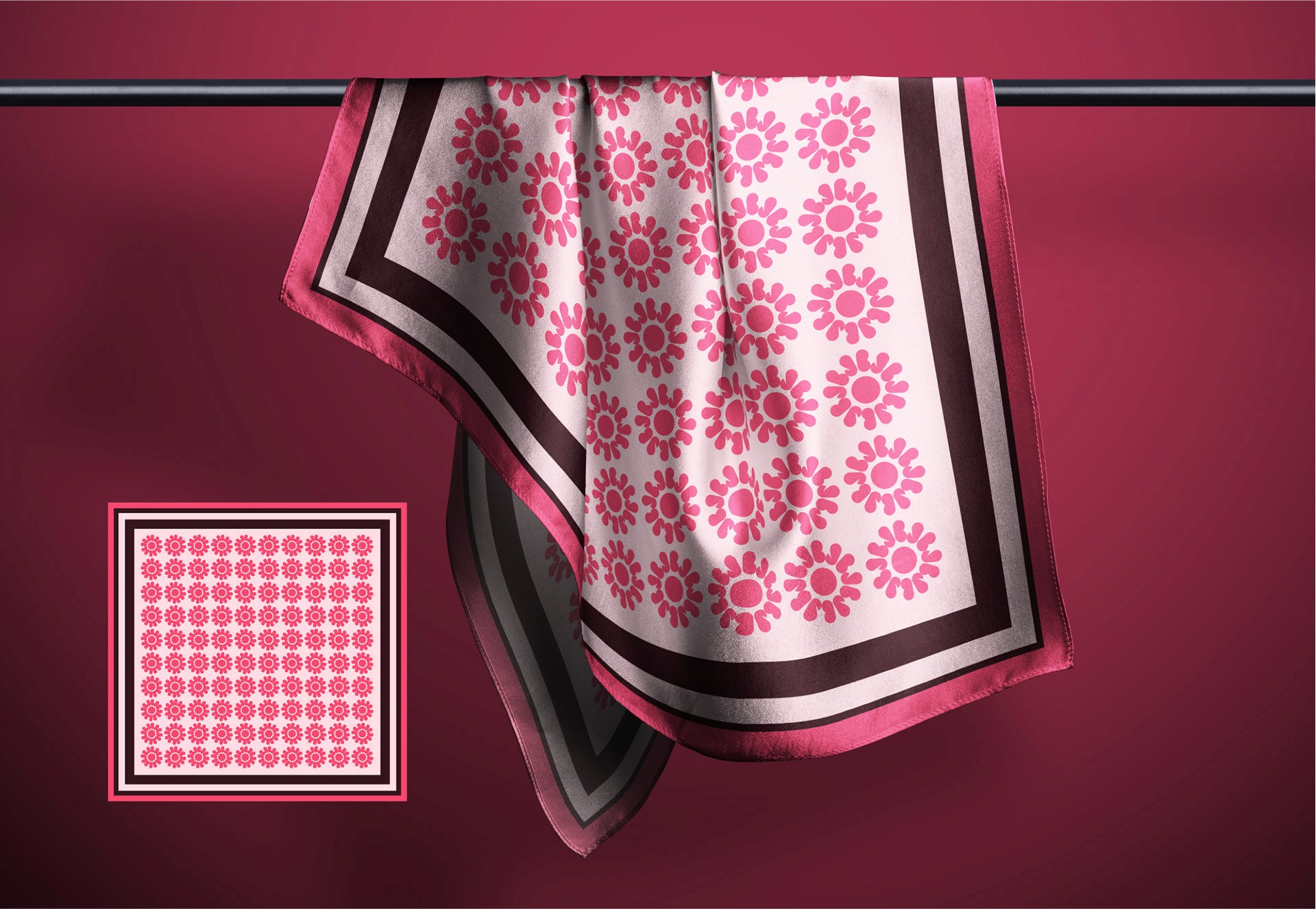
For stylish women who
appreciate sophistication and
tranquility in their attire.
For stylish women who
appreciate sophistication and
tranquility in their attire.
For stylish women who
appreciate sophistication and
tranquility in their attire.
For stylish women who
appreciate sophistication and
tranquility in their attire.
For stylish women who
appreciate sophistication and
tranquility in their attire.
For stylish women who
appreciate sophistication and
tranquility in their attire.
For stylish women who
appreciate sophistication and
tranquility in their attire.
For stylish women who
appreciate sophistication and
tranquility in their attire.
For stylish women who
appreciate sophistication and
tranquility in their attire.
For stylish women who
appreciate sophistication and
tranquility in their attire.
For stylish women who
appreciate sophistication and
tranquility in their attire.
For stylish women who
appreciate sophistication and
tranquility in their attire.
a
Client
JoBella
Year
2020
Service
Brand Identity
Overview
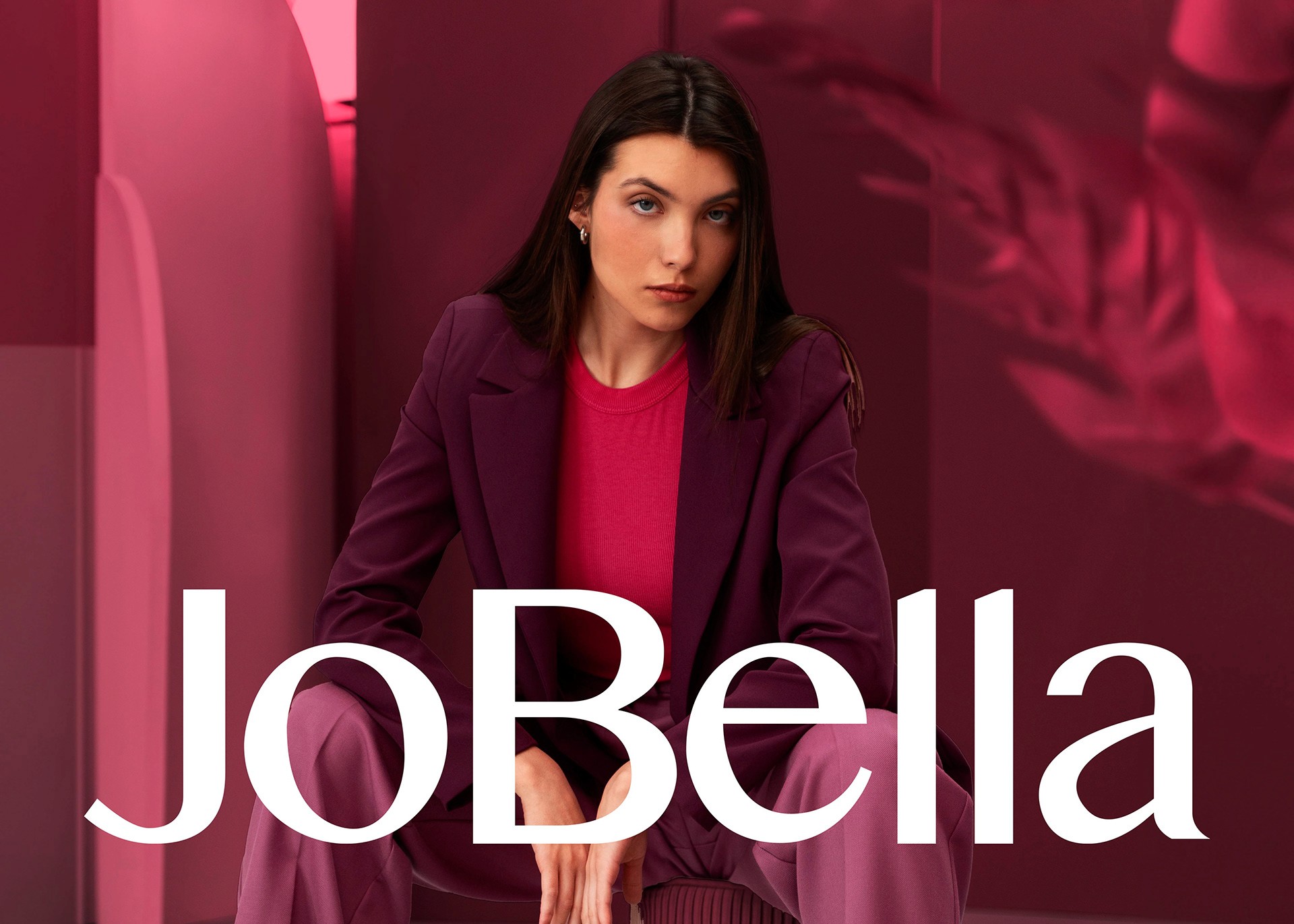
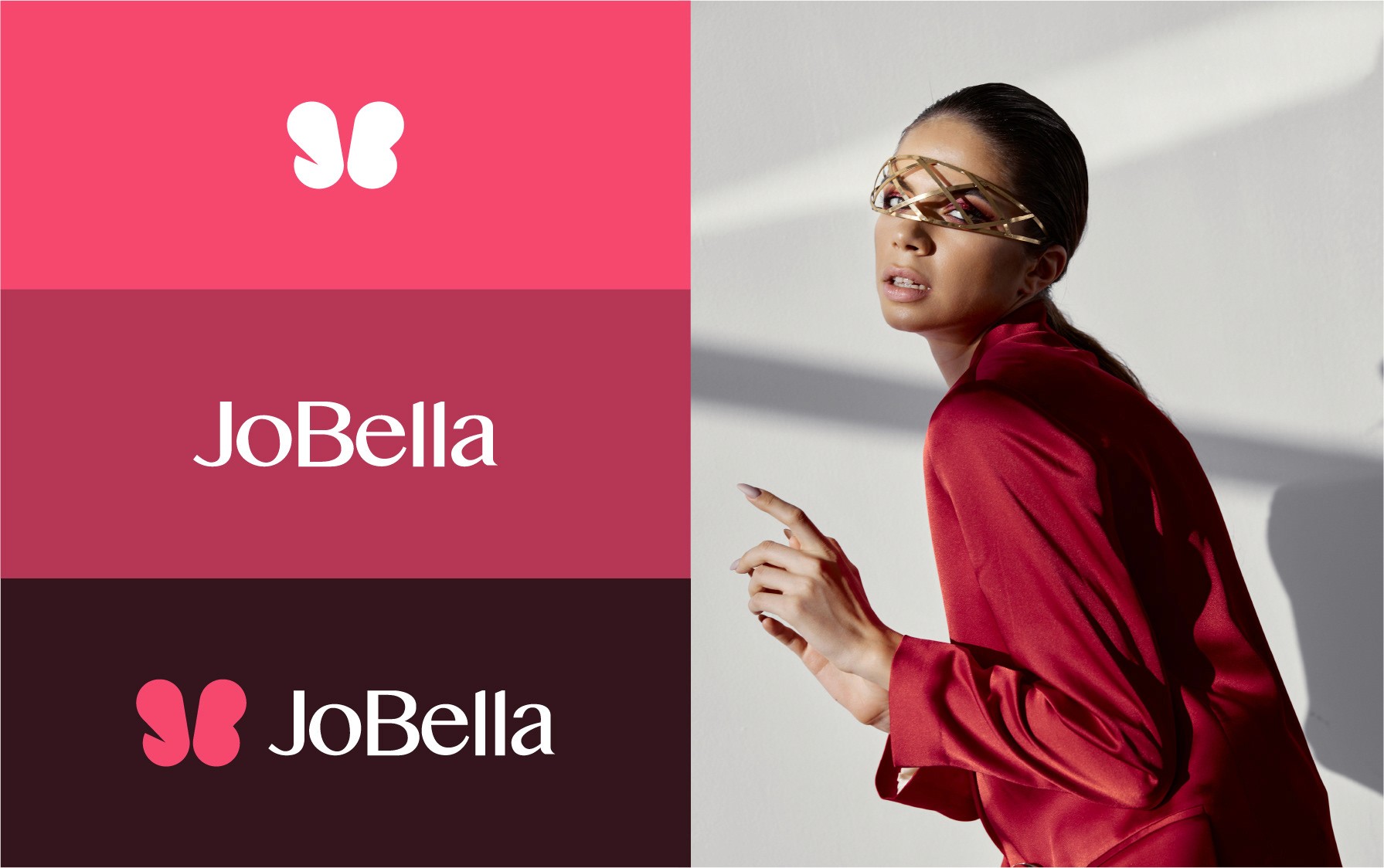
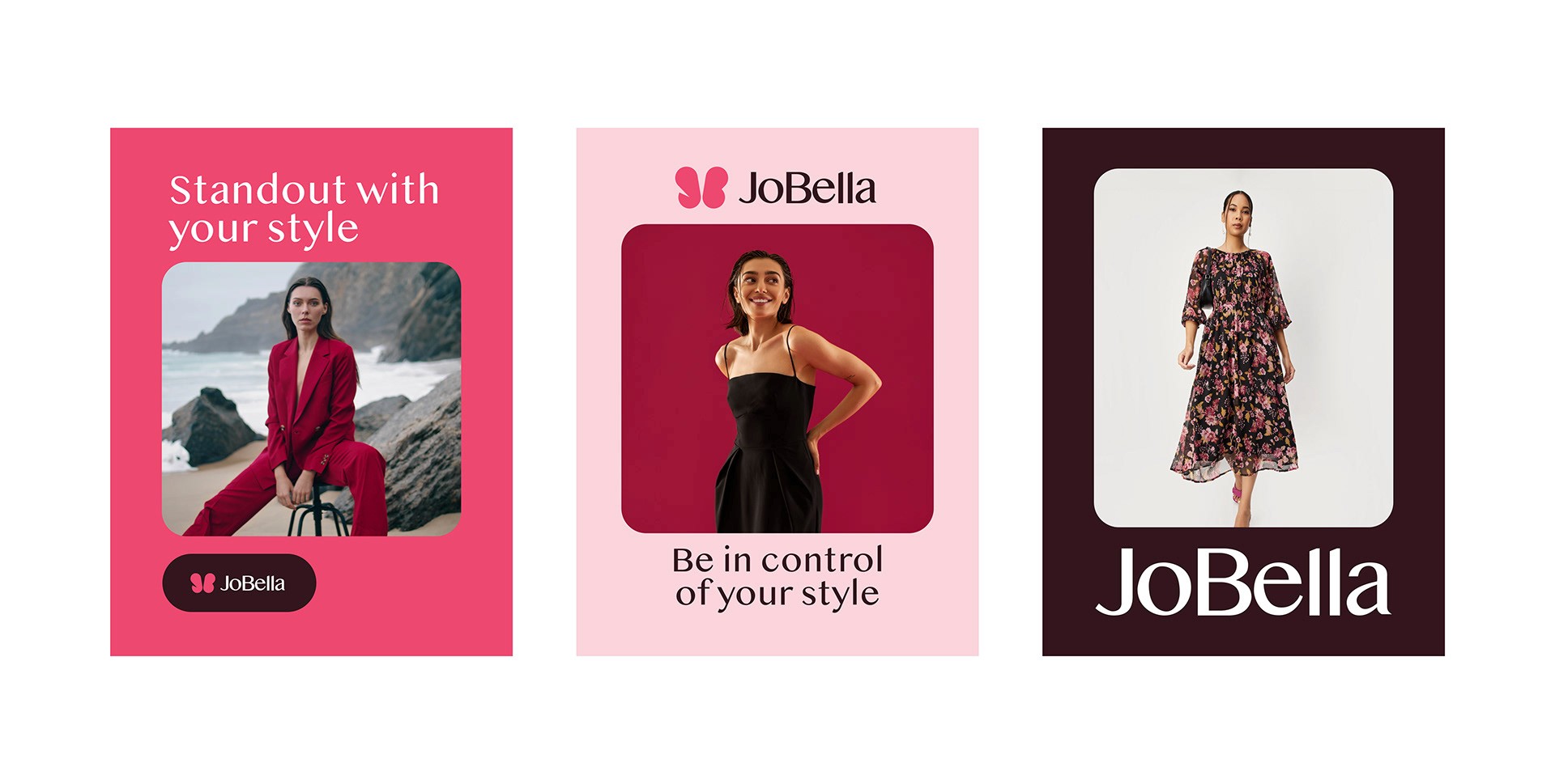
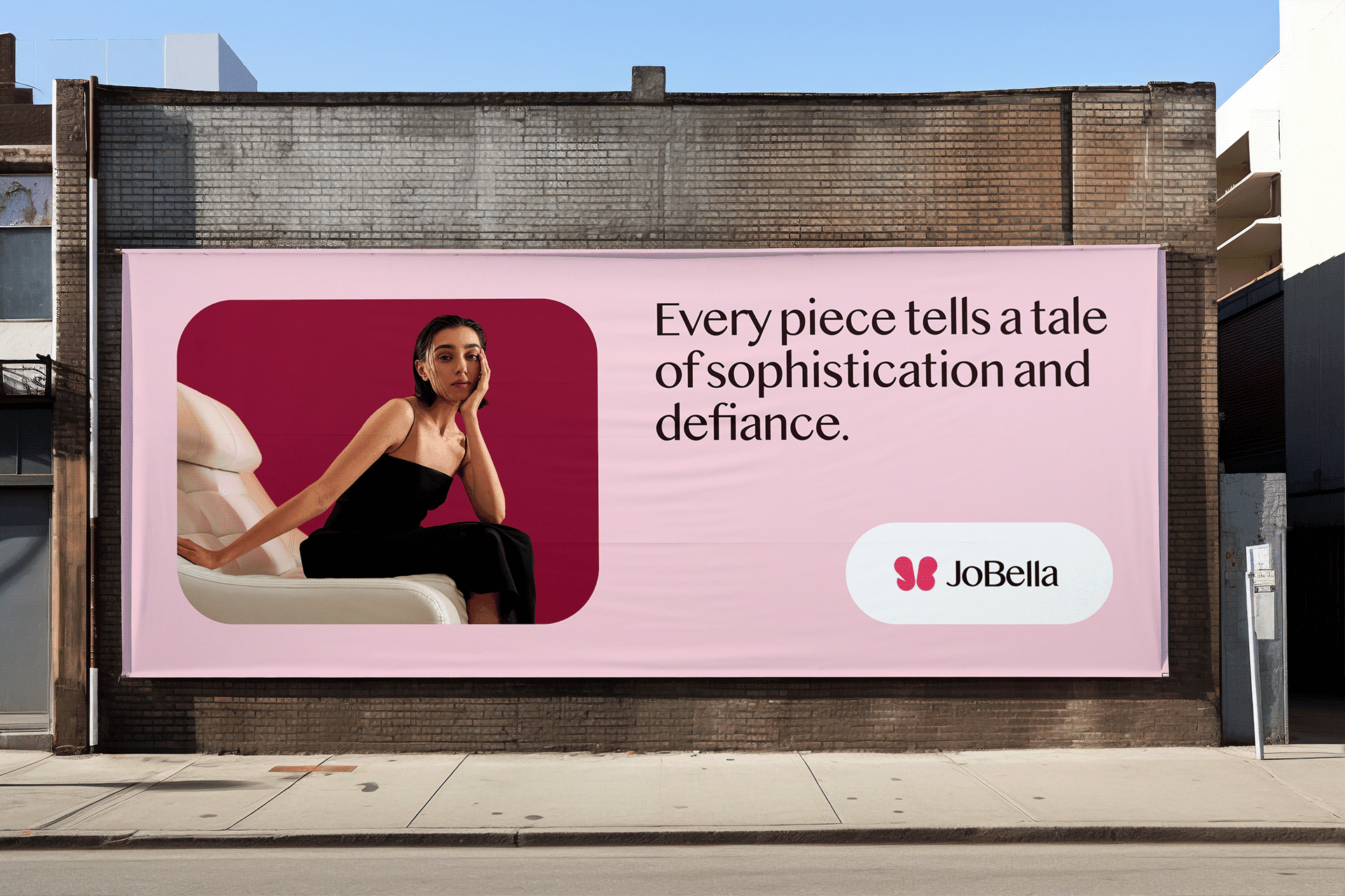
JoBella is a chic fashion brand offering exquisite and one-of-a-kind garments tailored for stylish women who appreciate sophistication and tranquility in their attire.
The Challenge
Upon examining other local fashion brands, I observed a trend of repetitive design elements such as scissors, sewing machines, and needles dominating their logos. Wanting to differentiate JoBella, I sought to create something distinctive and memorable.
The Goal
Our primary objective was to establish JoBella as a standout presence amidst a sea of fashion brands, exuding warmth and approach-ability to our audience.
Solution
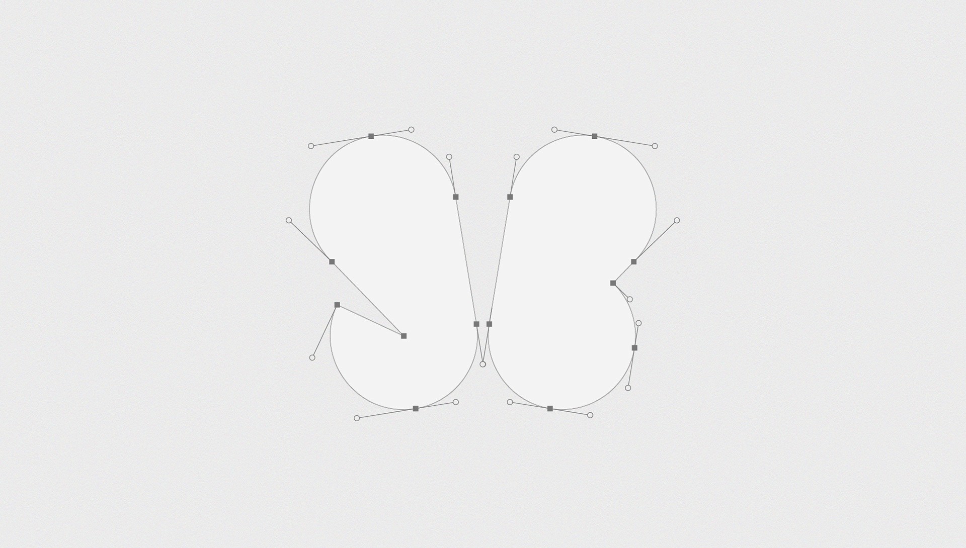
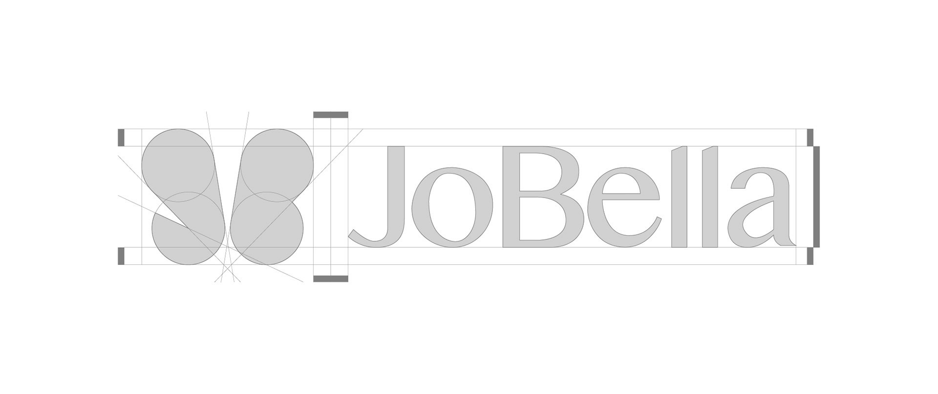
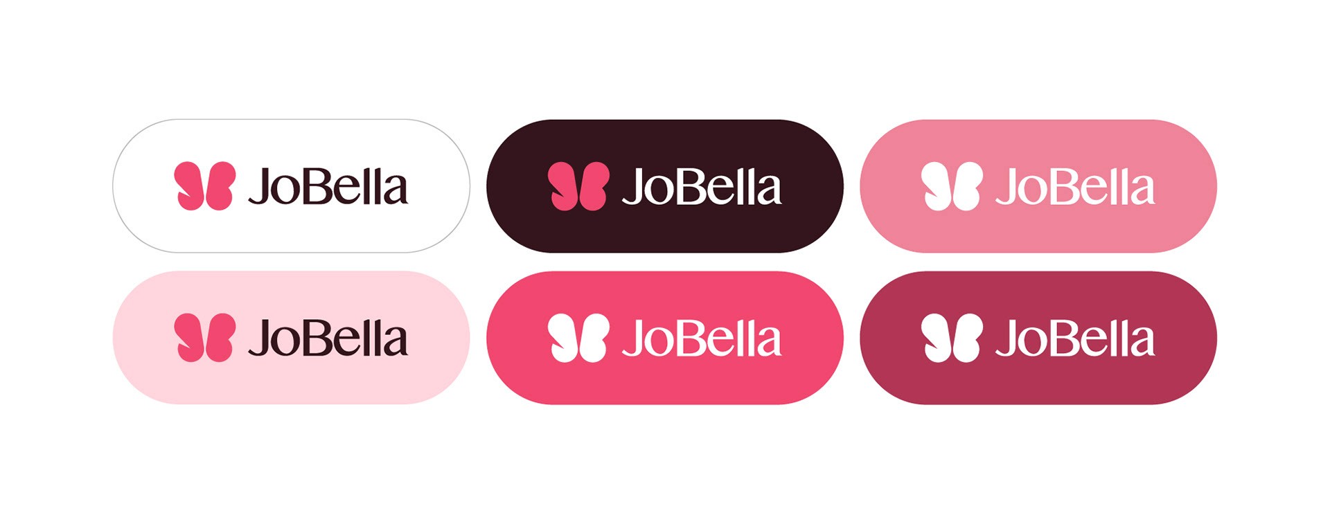
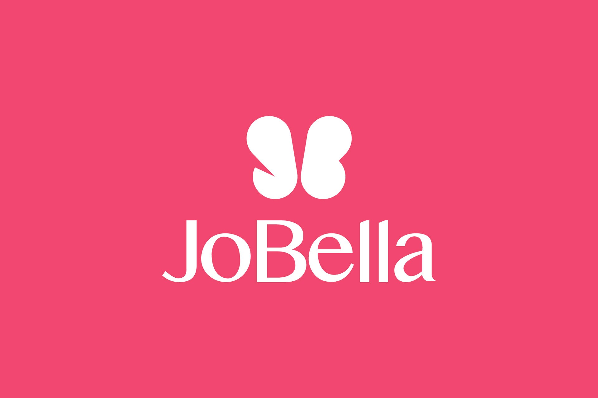
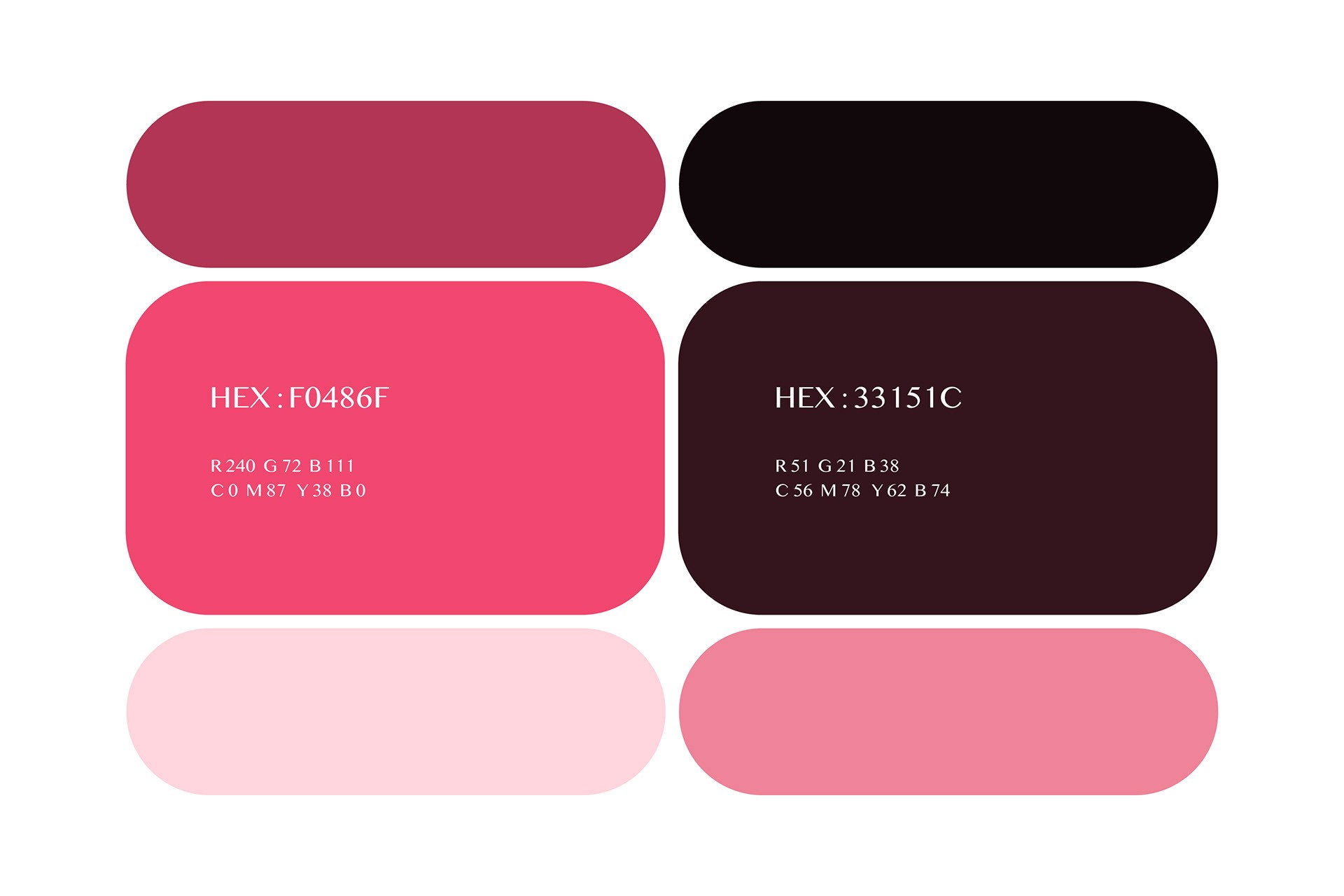
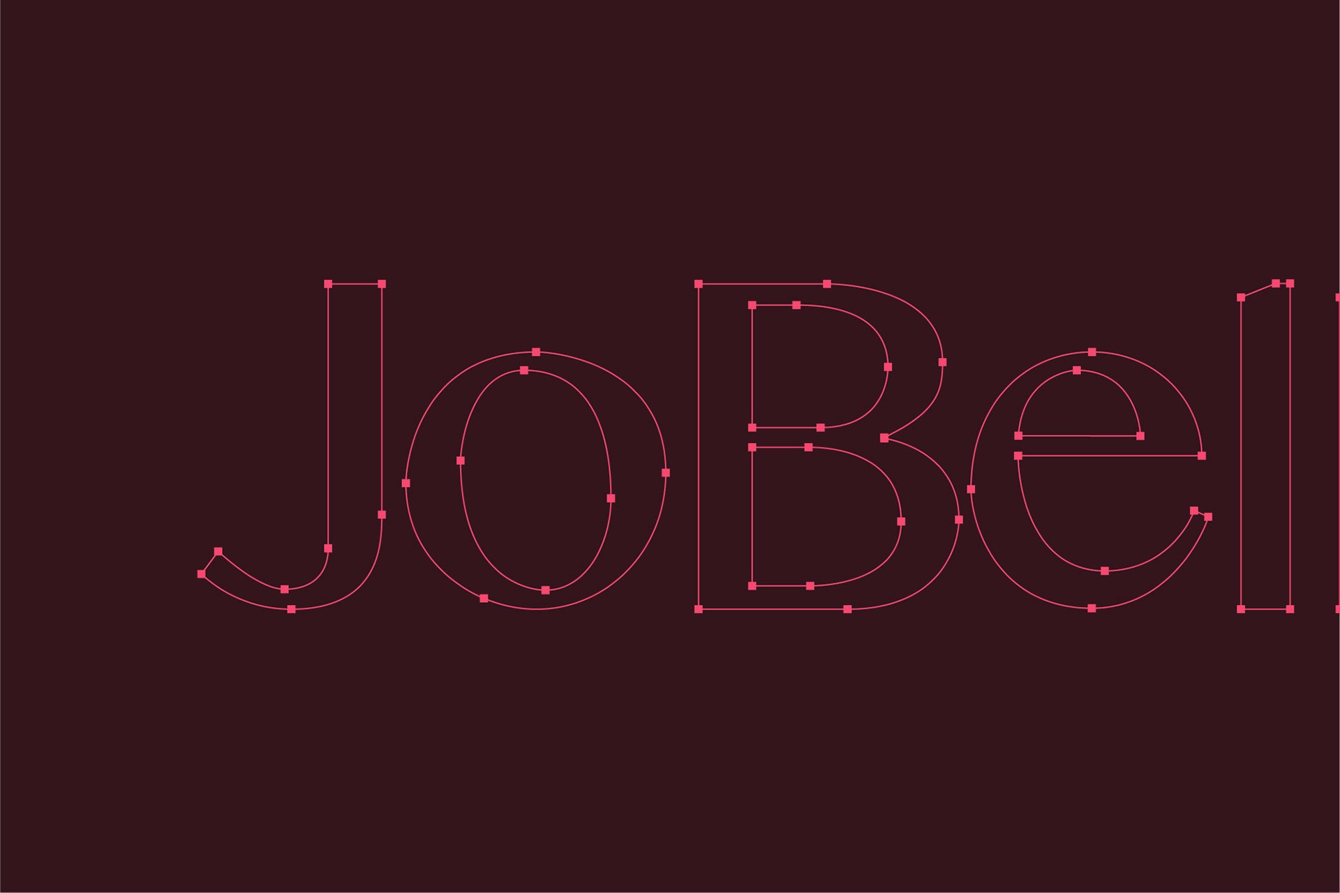
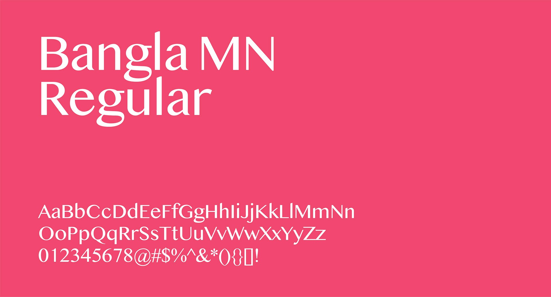
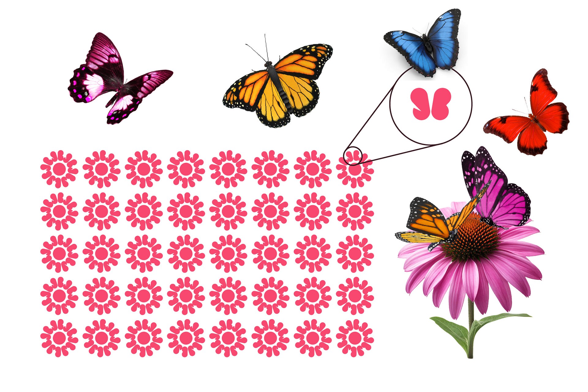
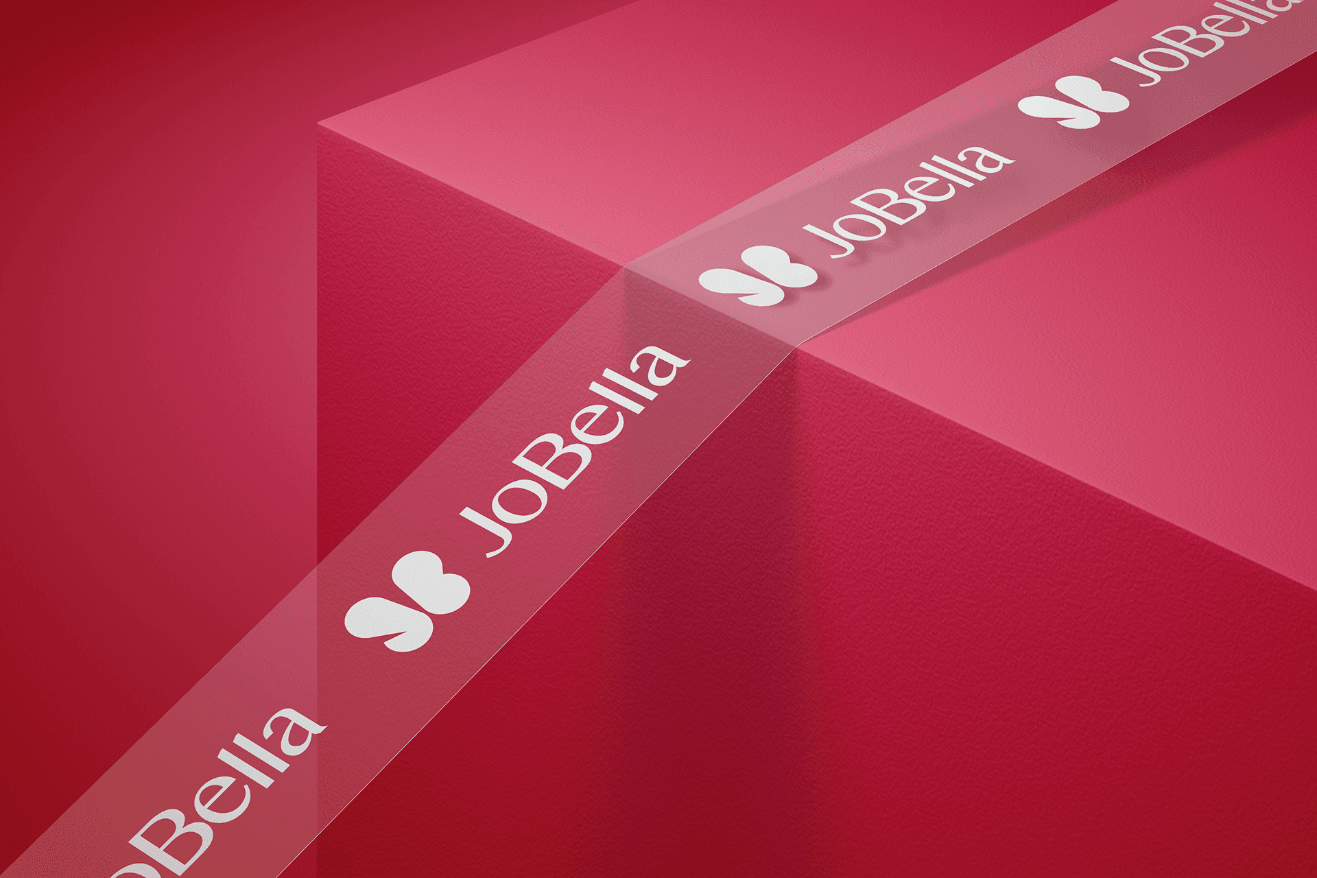
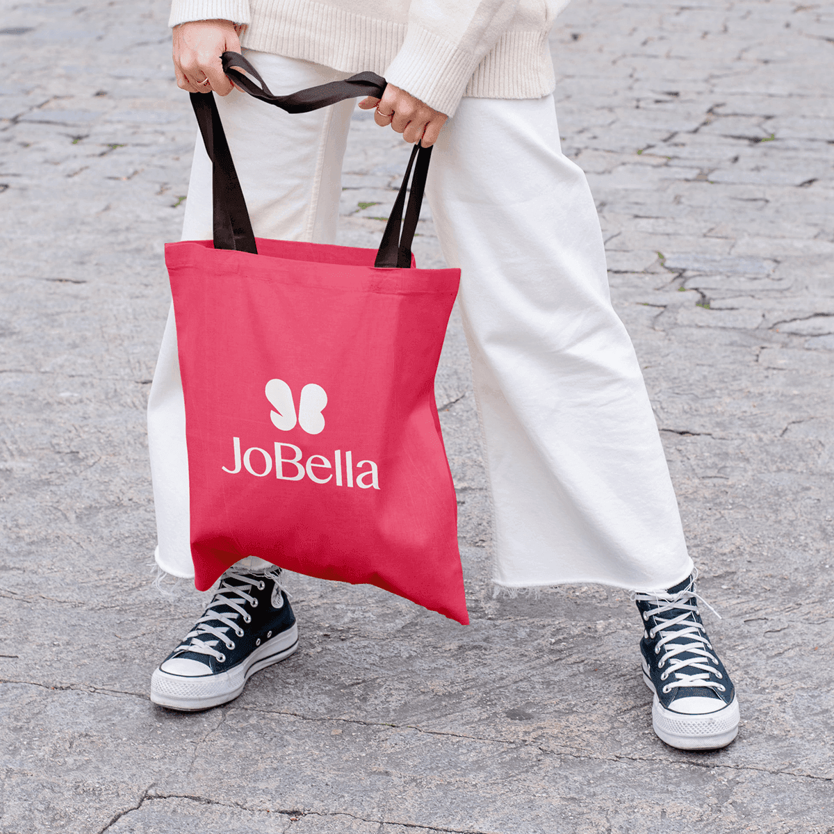
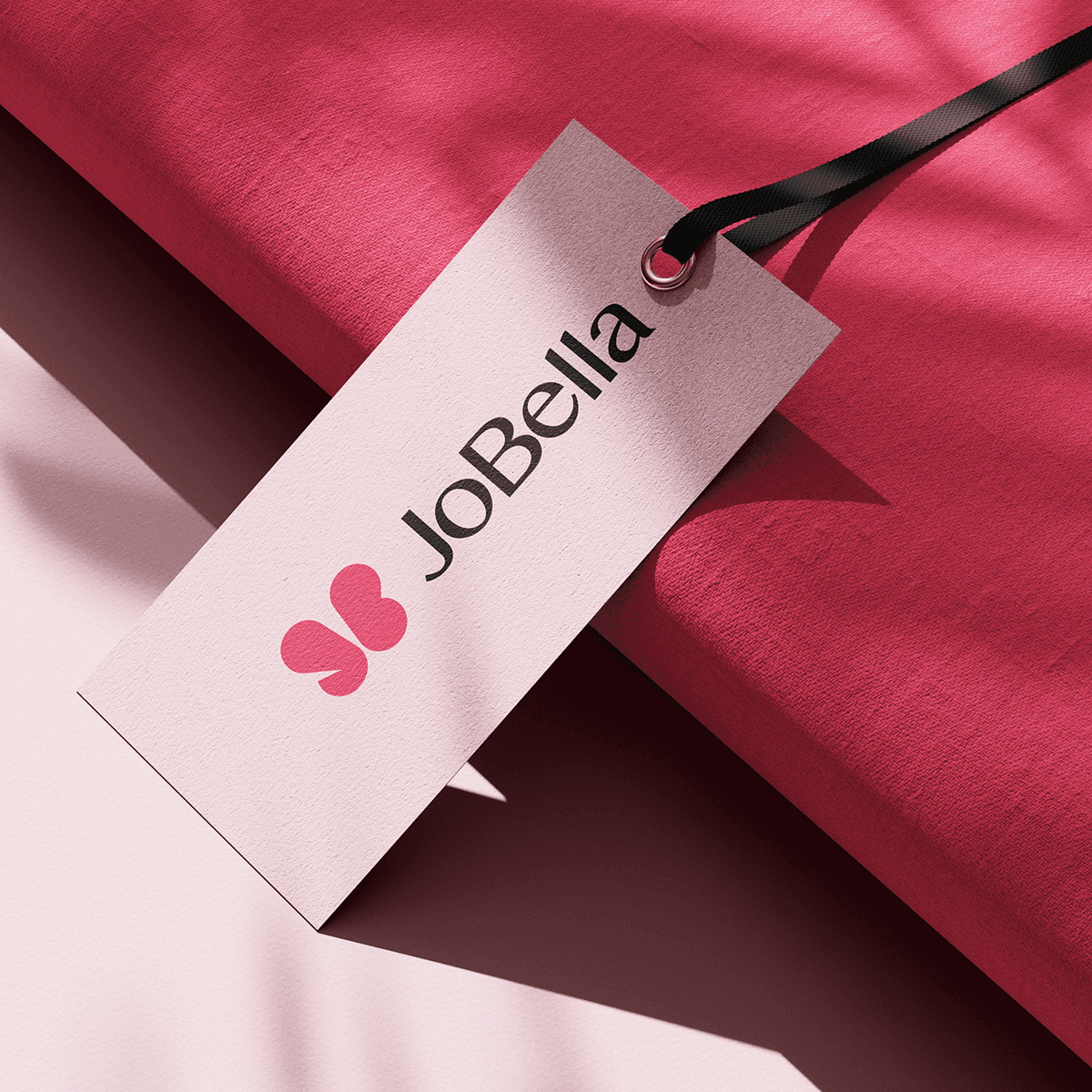
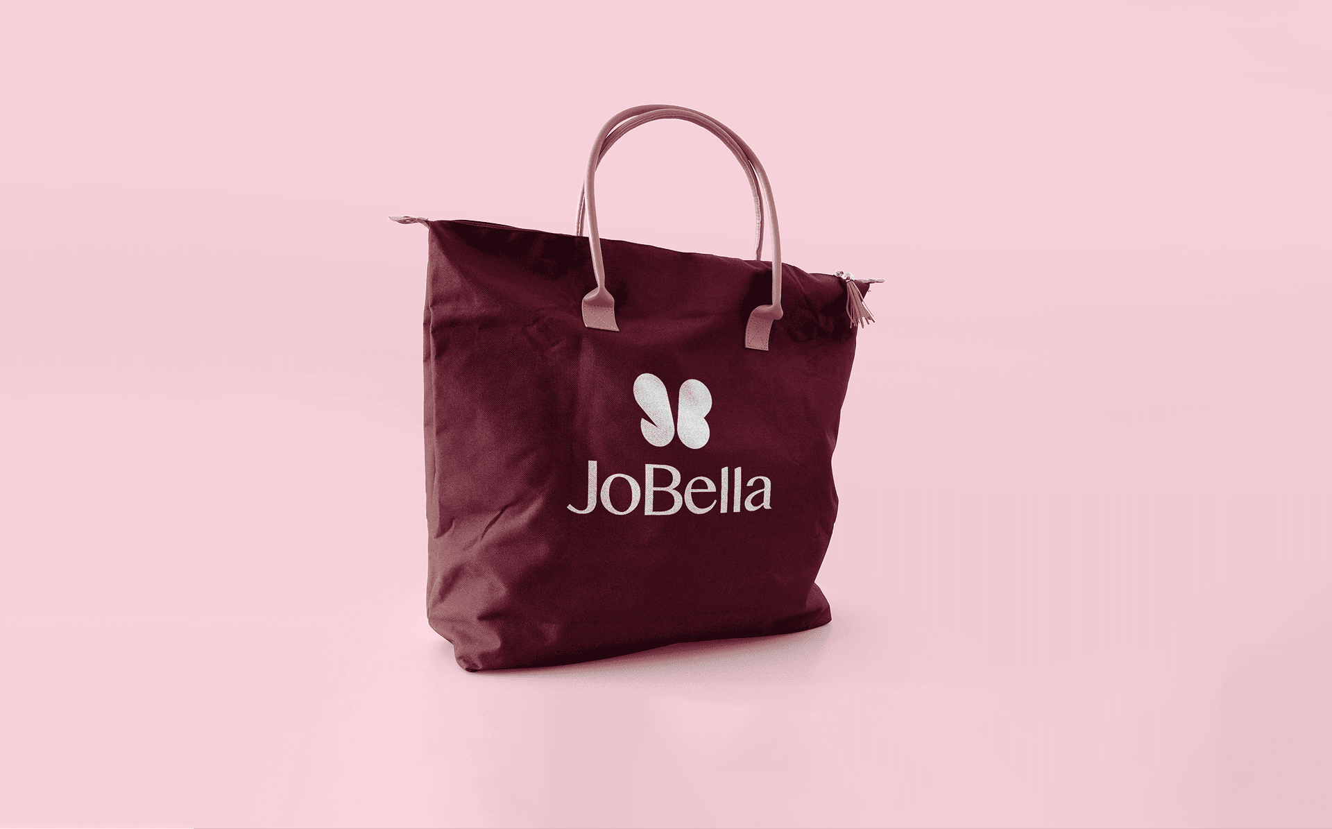
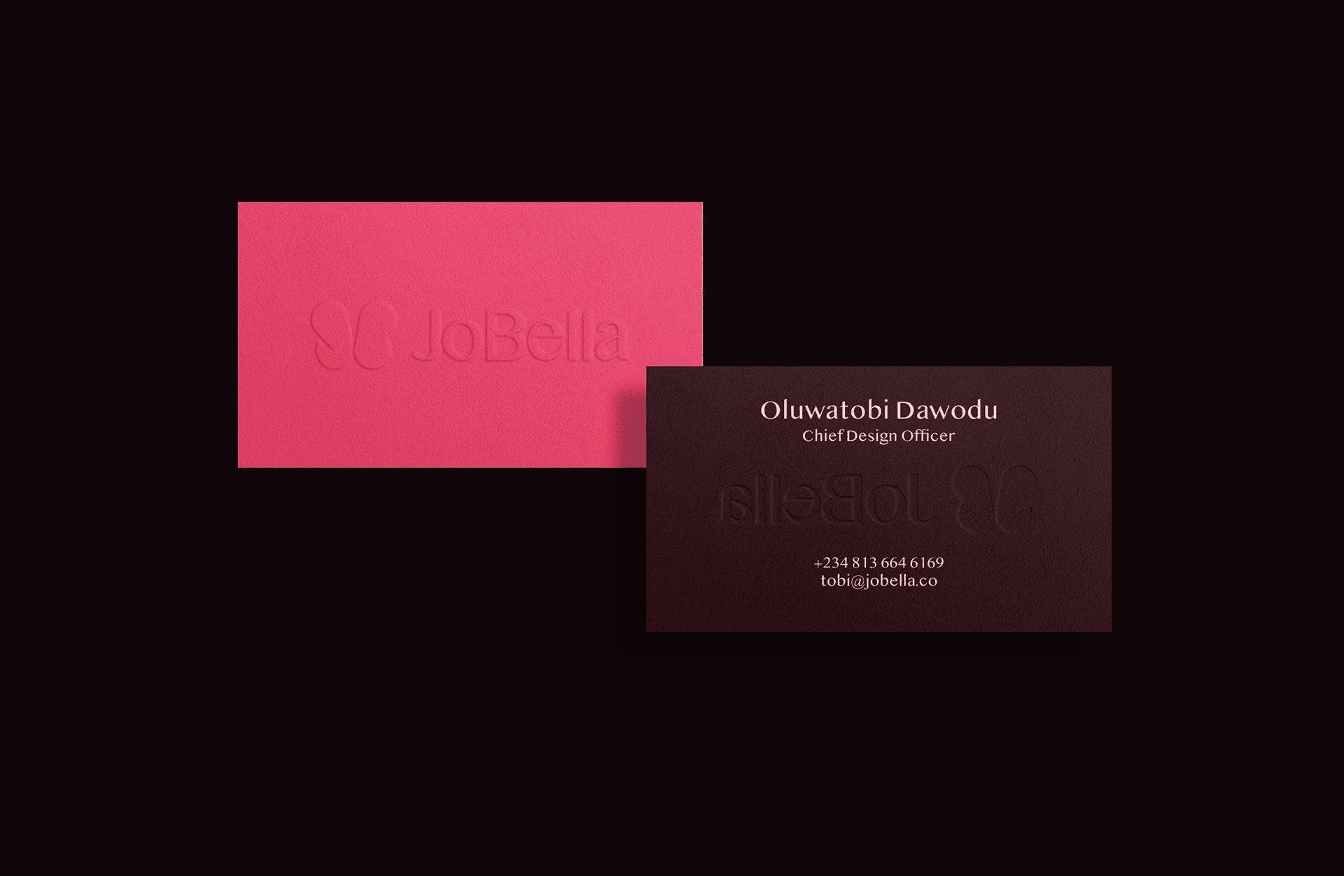
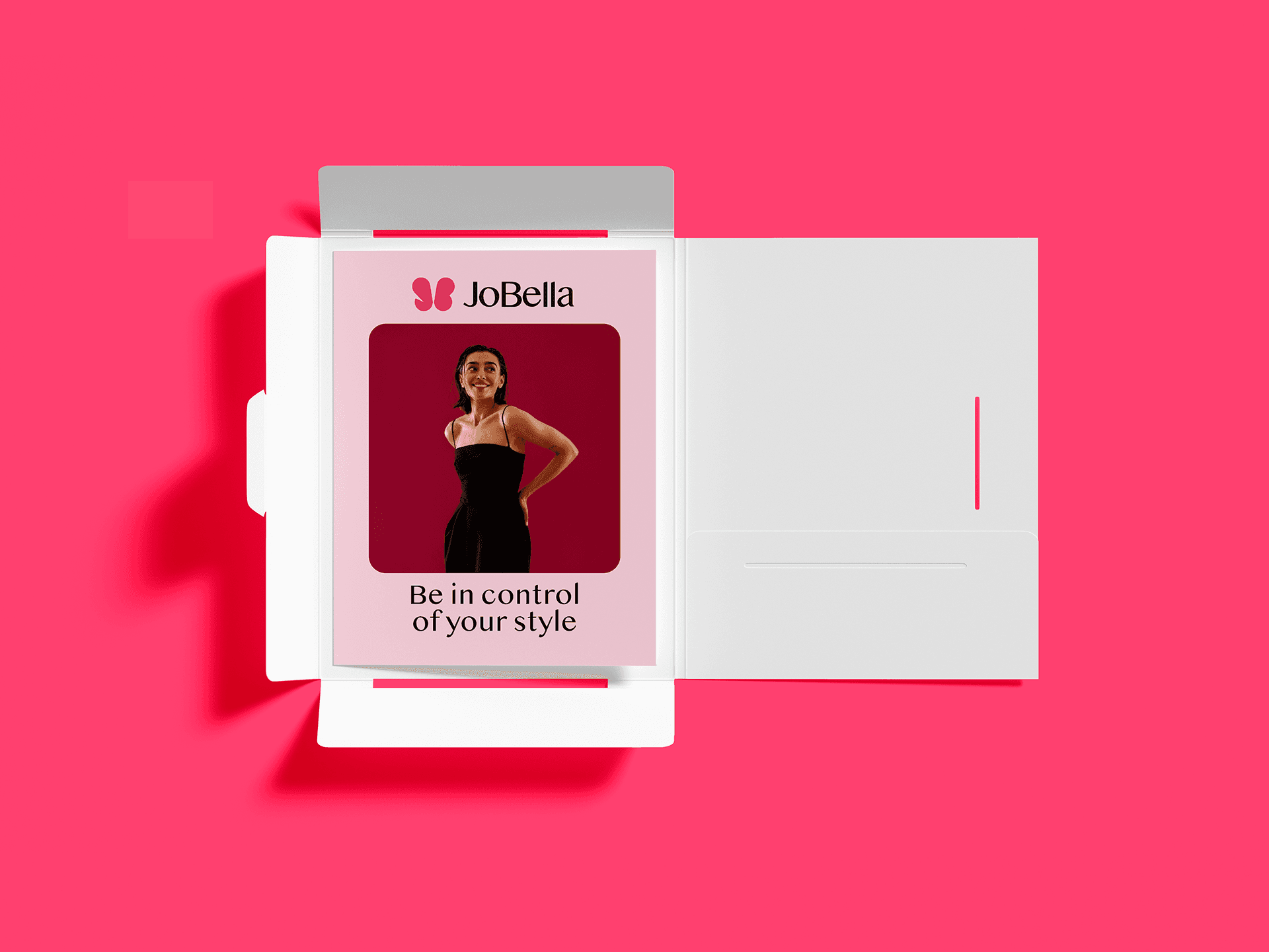
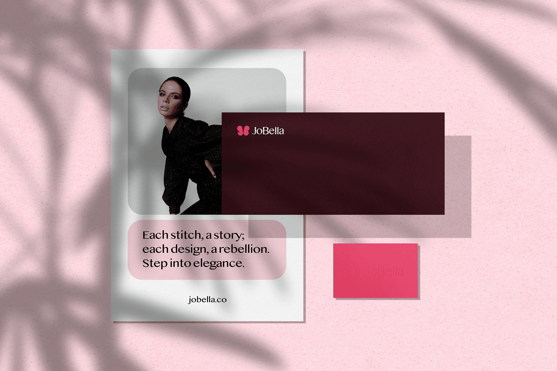
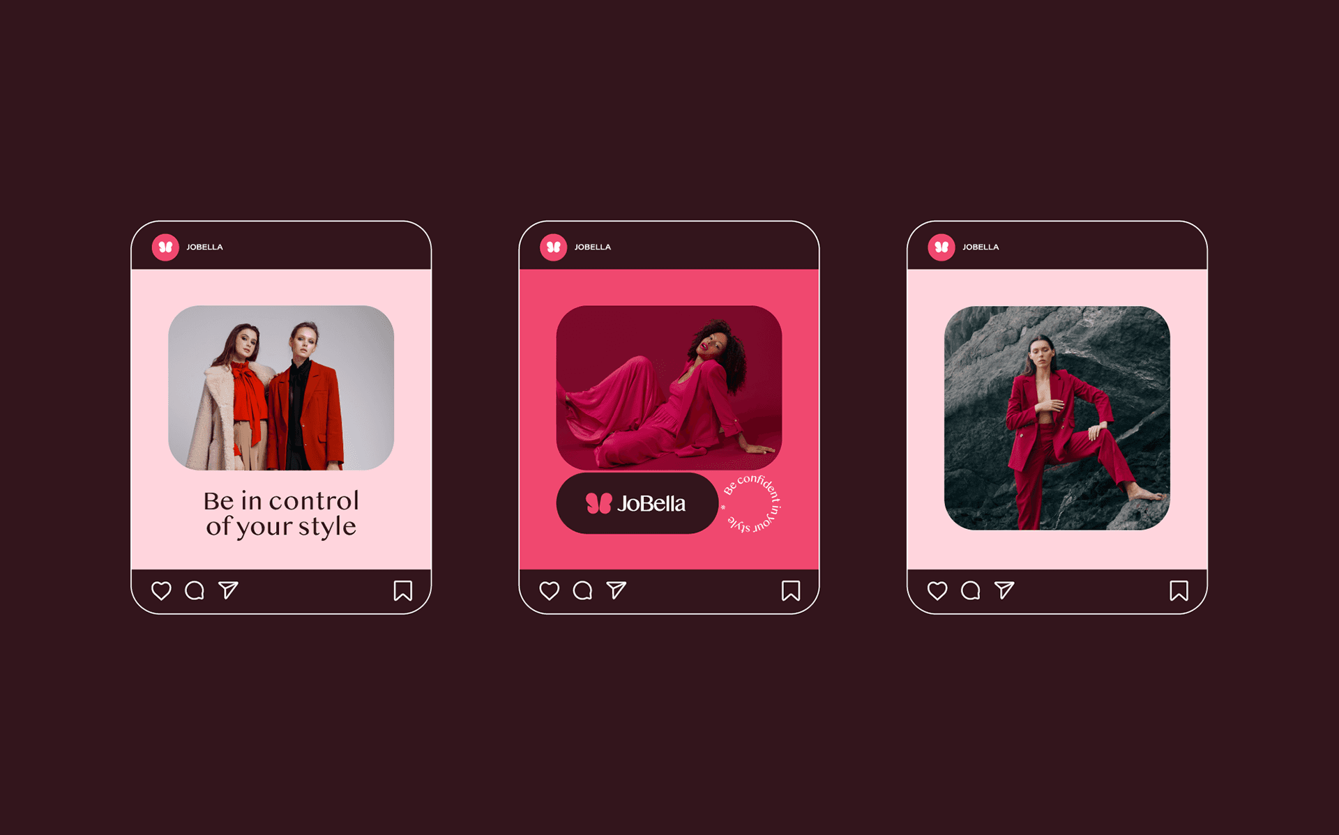
To achieve this, I embraced simplicity, refinement, and gentleness in our branding. The logo seamlessly intertwines the initials "J" and "B" with a butterfly motif, symbolizing our commitment to enhancing our audience's appearance and well-being. Opting for a sleek sans-serif font for the logotype, I maintained a minimalist approach to our brand identity. Additionally, I curated a color palette featuring shades of pink, signifying femininity, sophistication, and timeless allure, thereby infusing our brand with an air of elegance and allure.
Details
Client
JoBella
Year
2020
Service
Brand Identity
About
Homefynd redefines property ownership in Nigeria, offering a unique approach to finding your dream home. With Homefynd, renting becomes a pathway to ownership, as you spread payments like a subscription.
The brand embodies simplicity, innovation, and accessibility. The logo represents finding the perfect home, while the soothing colors and typography evoke comfort and sustainability. Ultimately, Homefynd empowers individuals to build a future they can call their own beyond just finding a place to live.
Related work